
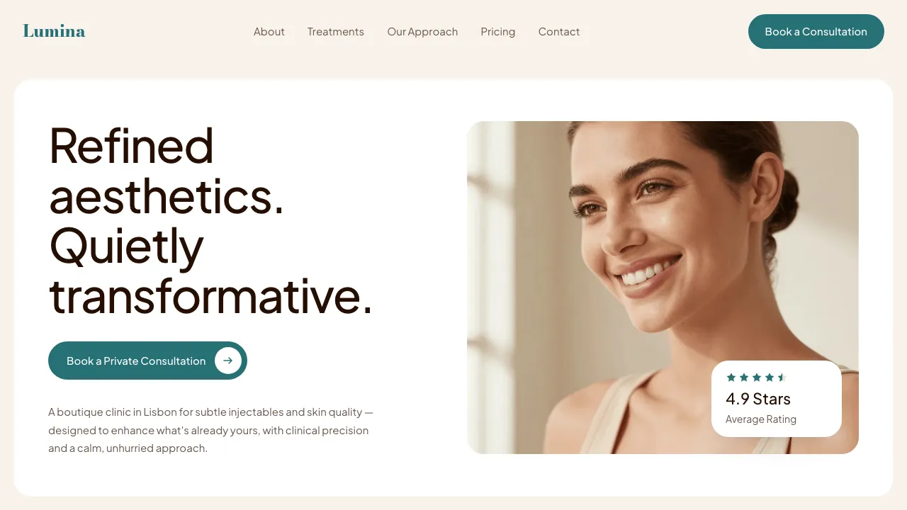
The brief
Lumina is a boutique aesthetics clinic in Príncipe Real, Lisbon. It sells subtle injectables and skin quality: anti-wrinkle injections, dermal fillers for lips, chin and jawline, and protocol-based skin work: skinboosters, biostimulators, mesotherapy. It does not sell surgery, threads or permanent implants, and it says so.
The consultation costs €60, runs forty-five minutes, and comes off your first treatment. Skin protocols start at €180 and injectables at €350. You are not treated on the first visit unless you ask to be. Four practitioners, all named on the page, all with faces.
The hard part is not the medicine, it is the proof. Every clinic in this category sells transformation and photographs it in a before/after grid. Lumina sells the opposite, enhance rather than transform, and a good result is by definition one nobody notices. There is nothing to photograph. The page has to argue restraint without a single piece of evidence that restraint worked.
The idea
Less, but better, printed at full size. If the result cannot be shown, the composition has to carry the claim, so the page is built the way the consult is run: nothing rushed, nothing shouted, every number given room.
Calm is the easy half of that brief and the dangerous one. A page can be quiet because it is composed, or quiet because it has nothing to say. So the quiet is built with weight: a display headline at 4.25rem, a €60 price printed rather than gated behind an email address, four practitioners with names and roles, and a price list that admits out loud that the number is a starting point.
Colour does the arguing by refusing to. The whole page is warm cream and floating white cards, and the only saturated thing on it is one deep teal: the wordmark, the lead-ins, the prices, the buttons, and a single solid panel behind the differentiator tabs. Everything else keeps to cream and coffee-brown, so the eye always knows where the next step is.
Two decisions carry the register more than any other. Headlines are set at weight 500 rather than 700, because a clinic that whispers should not set its headlines in bold. And the section lead-ins are sentence case, not tracked capitals: the category shouts in tracked caps, and this one does not shout.
The signature move
The aperture. One shape: a photograph cropped to a soft lozenge, its corners rounded fully away. It is the eye, the lens, the thing you are asking a clinic to have a good one of.
It appears three times and never twice in the same orientation: the clinic facade as a wide horizontal lozenge, the half-face in the discovery section as a tall arch, and the quote mark in the testimonials, two stadiums at 18px where the shape becomes punctuation. Everything else on the page is an ordinary rounded rectangle, the cards at 24px, so the aperture reads as a deliberate cut rather than a house style.
There is no icon beside the name. The wordmark is the mark. A 32px monogram was built and cut, because mixing a 999px radius with a percentage one makes the browser scale every corner by a single overflow factor, and the lozenge flattens into a square at that size. The shape only holds at photograph scale, so that is the only place it is allowed to appear.
Once, it moves. The facade lozenge starts closed, a 999px capsule showing only the centre of the shopfront, and opens as you scroll it through the viewport, its border-radius scrubbing down to 28px until the whole clinic front is visible. You open it yourself, at whatever speed you scroll. It is scrubbed and not pinned, because a page selling an unhurried consultation does not get to take the scroll out of your hands.
It happens in one place. The discovery arch stays an arch and never animates. A motif that moves everywhere is not a signature, it is a tic.
A good result is one you don't notice. That is a hard thing to photograph, so the page argues it in the composition instead.
Why it converts
Clinics in this category hide the price, and the reason they hide it is that the price is the objection. Lumina prints it wherever the doubt shows up: €60 and 45 minutes on the card that lands over the hero photograph, €60 in the pricing table, €60 in the FAQ answer about whether you need a consultation at all, which adds that the fee is deducted from your first treatment, and €60 again beside the booking form, over a line admitting the usual wait is nine days.
Then it answers the real fear, which is not cost. It is looking done. That objection gets the headline word for word, injectables and skin quality nobody will be able to tell you had, and the pillar that explains how it is achieved: under-dosed on purpose, starting below the usual unit count and topping up at the two-week review. Then the FAQ answer that ends by turning business away: if you want a dramatic change, we are not the right clinic. A page that refuses a customer in writing is a page you believe about everything else.
The proof is procedural rather than photographic. Forty-five minutes, most of it talking. Conservative dosing, built over more than one appointment, because it is easy to add and hard to undo. A review at two weeks, then maintenance every four to six months. Skin protocols in courses of three, a month apart. Nobody has to be told the approach is careful once they can see the schedule it runs on.
Every button on the page says the same four words and lands in the same place: book a consultation, at the form. The header is sticky, so from the first screen to the last that button is a thumb away. Between the reviews and the form sit three journal notes, the treatments the clinic says no to and the nine-day wait that is not a delay, and then the FAQ, parked directly above the booking panel where the last objections get answered. The final thing the page hands you is a street address, opening hours, an email and a phone number: the close of a trust-led sale is an invitation, not a gate.
How it is built
Coded, not mocked. React, Next.js and GSAP ScrollTrigger, every animation behind a gsap.matchMedia gate. Ask for reduced motion and Lenis is skipped, the aperture ships already open at 28px, and every entrance is absent rather than broken. Everything is authored visible; the JavaScript only takes things away and gives them back.
Contrast was measured against every surface a token sits on, not against white. The teal at #267175 clears 4.5:1 on cream and on the white cards, but on the mint FAQ cards it measures 4.23:1 and fails, so the questions and answers ship in #012326 instead. Nothing on this page is dimmed with opacity: a dim state here is a colour, and it is a colour that still passes.
Entrances are spent where they are worth something. Section headings arrive in reading order and photographs settle out of a 1.06 crop; the cards, rows and prices between them are simply there. Imagery is twenty-nine self-hosted WebP files through next/image, sized per breakpoint, about 880KB for the set. It passes a production build and works on a phone held in one hand.
Lumina Clinic is a fictional practice, invented so we could build the site it would need. The clinic is not real, its practitioners are not real, and the reviews are written. The build is: every section, every price, every line of code.