The brief
Mara Lindqvist photographs the same three places until nobody minds the camera any more. Nits del Port: Barceloneta's working port after dark, 34 photographs, still going. Els Terrats: the rooftops and their water tanks, washing lines and aerials, 28 photographs. La Costa: the R1 ridden north along the winter sea, 41 photographs. Magazine work pays for the personal series, and the personal series are why the magazines call.
The people who hire her are art directors and picture editors. They open a portfolio to settle one question, whether this person can hold a body of work together, and they settle it quickly, often on a phone, between two other things. They also look at photographs for a living, which makes them the hardest audience a website can be built for.
The first build treated that audience with silence: a grey-on-black gallery, wall labels, no colour anywhere. Correct, and forgettable. The revamp keeps the discipline and gives the page what the gallery version never had: a place, a process, and one colour with a reason to exist.
The idea
The site is not the gallery where finished work hangs. It is the room where the work is made and chosen: the darkroom and the editing table, with a visitor let in while the lights are still red.
Everything comes from that room's own vernacular. No photograph on the page is simply there. Every one develops, the way a print comes up in the tray. The one pinned scroll moment is a contact sheet, because that is where her selects actually get chosen. And the page's only colour is the two red things a photographer really owns: the safelight and the grease pencil. Red appears as drawn marks, a circle around a chosen frame or an underline beneath a claim, and as small mono labels. Never a fill, never a surface, never body text.
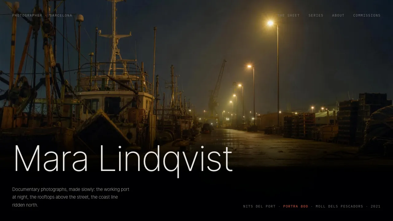
Two typefaces split the page between them. Inter Tight at weight 200 is the print voice: her name across the hero, the chapter titles, the one paragraph she speaks. IBM Plex Mono is the film-edge voice: frame numbers, edge markings, nav, form labels, the machine writing that lives on every roll of film. The scale contrast between the two is the whole typographic system.
The signature move
The page opens on one full-viewport photograph of the port at night, and it is not there yet: it develops. Black, then the latent image in dim red monochrome, because under a safelight there is no colour, held for a beat, then the colour flooding in as the lights come on, about three seconds. The ritual is CSS keyframes, but it does not run on a timer: it mounts paused and starts the moment the photograph has actually loaded, because a develop racing the network is a photograph popping in mid-ritual. Until then the page shows one red mono line: Developing… Her name stands across the frame's bottom edge, on a band of darkness that belongs to the photograph itself. The frame was graded so the type never needs a scrim.
Then the contact sheet: eight frames panning under vertical scroll, linear scrub, no easing, like a hand pushing a sheet across a table. Each frame carries film-edge chrome in mono: number and stock above, series, place and year below. Three frames are the selects, and as each one crosses the sheet a red grease-pencil ellipse draws itself around the frame. It never undraws. A mark made twice is a mark ruined.
The three series then get rooms of their own, and each room's hang encodes its geography. The port chapter stacks two verticals below a wide frame the way crates stack on a quay. The rooftop chapter steps its three frames from different heights, roofs against the sky. The coast chapter hangs its two verticals from a single full-width hairline: carriages on a track, and the hairline is the track. After the chapters, one photograph takes the entire viewport with no chrome at all: after a page of edge markings and pencil, one print is allowed to be finished.
Red is never a fill. It is always a mark somebody drew.
Why it converts
Most photographer sites are built to interfere: logo over the pictures, lightbox chrome, a slideshow that moves on before anyone has finished looking. This audience can tell in seconds whether a photographer trusts her own work, and a site that decorates its pictures is saying the pictures need help. Here the decoration budget is five red strokes and a develop, and every one of them is something that exists in her actual working life.
The develop earns its keep with this audience specifically. Art directors know what a print coming up in the tray looks like; the page performing that ritual for them says the person behind it still prints by hand, which the About section then confirms in her own words. The metaphor is a credential rather than a theme.
The end of the page is where most portfolios give up and print an email address. This one asks the four questions that decide whether a commission is real: what kind of work, when, what budget band, and what the job actually is. It qualifies the enquiry before the first reply, which is what she would otherwise spend two emails doing. Her name stands beside the form at full size with the lines a commissioner needs: Barcelona, available for travel, replies within two days, and the print sizes with their prices — the form offers a print, so the page names what one costs.
How it is built
Coded, not mocked. The hero develop is CSS keyframes gated on the photograph's own load event, so it can never race the network and pop in mid-ritual. The contact sheet ships in the HTML as a plain strip a thumb can drag, and GSAP upgrades it into the pinned, scrubbed pan only where the browser welcomes motion. Every grease mark is an SVG stroke whose server-rendered state is the finished mark. Ask for reduced motion or turn JavaScript off and the page is still complete: every frame, every chapter, every circle already drawn.
The commission form validates for real — six fields, inline errors, a busy button, focus moved to the panel on success — and it sends nothing at all. No fetch, no server action, nothing stored. She does not exist, so at the moment a stranger types a real email address the panel leads with the disclosure and only then echoes the enquiry back.
Contrast is measured, not eyeballed. The safelight red clears 6.39:1 on the page black, which is why it is allowed to caption as well as circle, and her name stands on the hero photograph's own burned-in darkness at 4.30:1 on the shortest viewport rather than on a scrim. Nothing anywhere is dimmed with opacity: every muted state is a colour further down the ladder, with its ratio written beside it.
Mara Lindqvist is a fictional photographer, invented so we could build the portfolio she would need. The person is not real, and neither are the series, the frames or the commissions. The enquiry form sends nothing and stores nothing. The build is real: every section, every frame number, every line of code.