
The brief
Harbourline Wealth is an independent, flat-fee fiduciary practice in Boston. Five advisors, $410M advised, retirement transitions and equity compensation for people who built careers in tech and biotech. No commissions. Nothing to sell you.
The people who call are 58 with a severance package that expires at the end of the month, or 47 with sixty-eight percent of everything they own sitting in one ticker. They arrive suspicious, and the sector has earned that. Every advisory site in America opens with the same photograph and the same promise, and the visitor has learned to read the sameness as a warning.
So the page has one job. Earn enough trust, in one scroll, that a stranger will send you the offer letter they have not shown anyone. The hero says the quiet part instead of a slogan: you'll make this decision once.
The first cut of this build got the restraint right and the identity wrong: it banned imagery outright, and what came out was austere and anonymous. Nothing on it could be recognized twice. The fix was not to reach for stock photography. It was to draw more.
The idea
A plan is a line drawn across decades. So the page is a line. And a line has to be drawn on something, so the page is also a chart.
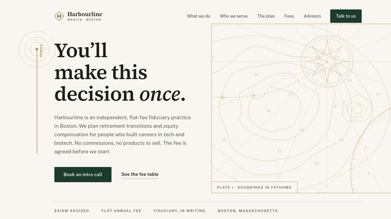
The headline stands beside the survey, not on it. The chart has its own plate: the hero's right column, ruled off by a hard 1px gold edge and marked Plate I, engraved with six nested depth contours around the basin, a shoal in the fairway, a dotted graticule, soundings in fathoms, sixteen rhumb lines radiating out of a sixteen-point compass rose, a hatched headland, and a dashed plotted course. It is not a photograph of a chart. It is a chart, built as SVG, path by path, which means it is crisp at any density, costs no image weight, shares the page's single gold token, and can never drift out of the palette.
That is where the identity of a firm like this actually lives. A private bank signals trust the way a banknote does: with an engraved line nobody else could be bothered to draw. Not with a handshake, a jetty, or a couple on a beach at sunset.
The same hand cuts the rest. Six glyphs, one per service, stroke-only, square caps, no fills, no rounded corners, and every one of them a chart figure rather than an icon. Retirement is a course that climbs and then goes level. Equity compensation is the cliff and the vesting stair. Tax is a tide gauge. Estate is a beacon: what is still lit after you. Education funding is a star sight: a fix taken on something you cannot reach. Business exit is the course out through the harbour mouth. The wordmark is the surveyor's mark for an established position: a double ring with cardinal ticks, the firm's initial standing inside it.
Everything else is taken away. Source Serif 4 carries the claims and the numerals, because a fee figure is an argument, not chrome. Gold is only ever a line: never a wash, never a panel, never body text. And the chart never moves: no parallax, no drawing-in, no reacting to the cursor. It is a printed plate, and the line is drawn on it.
The signature move
One continuous 1.5px stroke draws its way down the entire page: gold on the ivory panels, ivory on the deep pine ones. Scroll owns the pen, so the tip sits at the 70% draw line and never gets ahead of the reader.
It begins on the chart. The plotted course leaves the compass rose, crosses the basin, and exits through the plate's left rule at a marked departure fix, and out on the ivory the line picks it up, at an origin fix whose contours are drawn around the line's own start dot rather than on the plate, so the join is pixel-exact at every width. The line is drawn out of the survey, not laid on top of it.
Then, in "The plan", it leaves its rail and walks a 30-year timeline as a staircase. 55, the map. 62, the paycheck replaced. 70, the floor. Beyond, the part your family will thank you for. Each waypoint steps one measure further right, so descending the page is descending the plan. And because waypoint 55 promises every holding in one drawing, the drawing is there: Plate II, held sticky beside the staircase, one spine, a branch to every holding, a figure at the end of each ledger rule, marked Specimen so its numbers cannot be mistaken for a client's.
The staircase is not a drawing. The waypoint blocks are laid out in CSS, their positions are measured at runtime, an SVG path is built through where they actually landed, and scroll scrubs the dash offset. Resize the window, change the copy, load the serif late: the path re-measures and still meets every dot.
After "beyond", the stroke returns to the rail and carries on as if nothing happened. That is the argument: a plan is not a moment of drama, it is a line you keep drawing. It ends by turning ninety degrees and underlining the closing headline in gold, the only gold stroke on pine anywhere on the site, and the intro-call form sits directly beneath it. The line arrives at the ask.
The numbers are the honesty.
Why it converts
Financial advisor sites hedge. A stock handshake, a silver-haired couple on a jetty, "your trusted partner in the journey ahead", and the fee three clicks deep in a PDF, if it is anywhere at all. Every firm ends up looking like every other firm, and the only question left is what got left out.
This page says the fee out loud. It is in a table, on a pine panel, in the serif: $9,600, $15,000, $21,000 a year, priced by complexity, agreed before any work starts, billed quarterly. Then it does the arithmetic the sector prefers to leave undone. A typical 1% advisor on a $3M portfolio collects $30,000 a year, more after a good year, the same after a bad one. Ours is on this table, and it stays there.
The numbers are the honesty. Everything else follows from putting them somewhere they cannot be missed: "You pay us. And nobody else does." Five advisors, named, photographed, each with the thing they actually do. A firm that asks for the offer letter you have shown nobody should be willing to be looked at. Even the journal keeps count: two notes, under a lede that admits "so far that is twice".
The intro call is built like the fee table: plain, exact, nothing hidden. Name, email, an investable-assets band, the decision on the table, when the next 45 minutes suit. Solid surfaces, one hairline under each field, no glass and no dimmed-out text. And it is honest about the one thing a concept build has to be honest about: it sends nothing, and its success panel says so before it says anything else.
Trust is the entire funnel in this business. A site that states its price before anyone asks, and admits what it is at the moment you would hand over your email, has answered the visitor's real question before the copy starts working.
How it is built
Coded, not mocked. One line is drawn from the hero to the footer: the straight runs are scrubbed 1.5px rules, the staircase and the closing turn are SVG paths built from the real positions of the elements they pass. Every section shares one rail position, so the segments meet flush and read as one unbroken stroke, and the closing underline re-measures when the form beneath it becomes the success panel.
Contrast was computed, not estimated, and one number changed the design. The chart's first cut capped every stroke at 0.34, because with the survey lying under the text anything heavier dropped the hero lede below 4.5:1. That was the right measurement and the wrong conclusion. The plate got territory instead of alpha: its own ruled-off column with no text on it, the lede at 6.32:1 on clean ivory, and the contours finally inked at 0.45 to 0.60. Nothing on this page is dimmed with opacity; every muted state is a color step, and every step is measured.
A visitor who has asked for reduced motion gets no smooth-scroll layer, a line that is already fully drawn, and a timeline that is a plain readable list. The form validates in the browser and sends nothing: no fetch, no server action, no storage.
Harbourline Wealth is a fictional firm, invented so we could build the site a flat-fee practice would need. There is no firm, no client money and no advice here: the fees, the advisors and the 30-year plan are illustrative, written to be built against. The intro-call form sends nothing and stores nothing. The build is real, down to the last line.