
The brief
Northlight ingests tickets, chats and call transcripts, clusters them into product issues, and puts a number on what each unfixed issue costs in churn and support load. One plan, $59 a seat per month, $49 on annual. Ingest is free, because a rough month for support should not be a billing event.
The buyer is a VP of Product who already owns four dashboards and has no appetite for a fifth. The page has to survive a person who builds software for a living and has seen every hero mockup in the category.
There is also nothing to photograph. A restaurant has a fire, a clinic has a room, a fashion label has cloth. B2B software has a screen. We took this case because it removes the crutch: make the page beautiful out of the product's own surface, or don't make it beautiful.
The idea
Support is an analytics stream nobody reads. Northlight reads it. So the site is built out of the same parts the product is: a #0B1220 base, panel surfaces one step up from it, 1px borders at #223049 doing all the depth work, and no gradient anywhere on the page.
Mono microlabels sit on the sections the way they sit on the cluster card, as panel chrome with a status dot rather than a tracked marketing eyebrow floating above a heading. The labelling grammar belongs to the product, and the marketing page borrows it.
The story gets told once, visually. Before Northlight, loose scraps. After, docked panels. The problem section shows the scraps: five raw fragments, tilted off the grid, quoting the queue. "Export failed again. Third time this week." "Honestly, we are already evaluating alternatives." They are the only panels on the page that never dock, and after them the snapped grid reads as relief.
The signature move
Panels dock. That is the motif, and it is also what the product does: thousands of loose messages snapping into one ranked list.
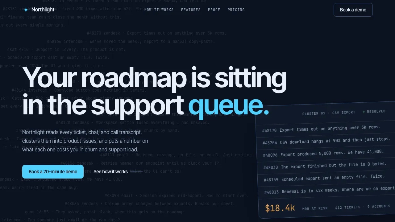
In the hero, fifty real support strings stream up behind the headline, mono, bleeding off all four edges. Six fly out of the noise and land on the ruled slots of one cluster card as its figures tick up: 412 tickets, 31 accounts, $18.4k of MRR at risk. The card sits at −2°, cropped by the right viewport edge, the cyan "queue." crossing its top border. The noise becomes a number before you have read the subhead.
The feature grid is the single pinned scroll section on the page. The viewport locks and five bento panels fly in from off the grid and dock in sequence, scrubbed to your scroll, each one's number ticking up as it lands: 4,216 messages into 42 issues, $18,400 of MRR at risk, a +41% spike, 26 hours a week of support burned. A counter in the corner reads Docking 0/5, then Docked 5/5.
Behind the dock there is a faint dot grid, drawn only there: the canvas the panels snap to, not wallpaper. The small version of the same idea: hover a panel and four corner brackets appear at its edges, like a snap target in the product. Even the closing CTA panel docks into place, settling out of a −1.2° tilt. The page ends the way it opened.
Nothing here is a screenshot. The queue is markup, and it is running.
Why it converts
Most B2B software sites sell software with a picture of software. A screenshot in a floating browser frame, tilted and blurred at the edges. An illustration of weightless figures standing near an oversized chart. Then a list of features with icons beside them. Each one is a step removed from the thing being bought, and the person doing the buying can tell.
This page takes the step out. The queue and the cluster card are real HTML and CSS, so there is no image to go soft: the hero stays pixel-crisp at 400% zoom and renders at whatever font size the reader has set. The queue never stops streaming, the Resolved dot blinks, and on scroll the queue drains of colour while the card lingers. That is the product surface, running, and it costs a visitor nothing to look at.
The commercial detail sits on the page instead of behind a form: the price, the connectors, the 90-day backfill on day one, free viewers. The close asks for one source and about an hour of setup, then makes the only promise worth making to a sceptic. If the top of the list surprises nobody in the room, don't buy it.
How it is built
Coded, not mocked. The queue is server-rendered markup and the six resolved rows render inside the card from the start, so with JavaScript off, or motion declined, the hero is already finished. There is not one image on the page: even the field-note plates are drawn from the same queue ink, panel ladder and dot grid as everything above them.
Ask for reduced motion and the page renders fully assembled — no pin, no smooth scroll, numbers already at their final values. Below 1024px the pinned dock becomes a stacked grid, because trapping a phone in a pinned scroll is how you lose it. And contrast is measured rather than assumed: the queue reads as ink at 12%, but it is a resolved colour, #262D3A, never type dimmed with alpha, so every string the hero sets over a queue glyph still clears AA.
Northlight is a fictional software company, invented so we could build the site it would need. The company is not real. The build is: every panel, every number, every line of code.