
The brief
VELL makes womenswear in Copenhagen, and has made the same twenty-four pieces since 2017. No seasons. No drops. There has never been a twenty-fifth. Three cloths: wool recycled in Prato and sorted by colour before it is spun, organic cotton woven at one mill near Porto, dead-stock silk bought in small lots from houses that ordered too much. When a lot runs out, the ines dress waits for the next one.
When a piece improves, the old cut goes to the archive and the new one keeps its name. The agnes coat is on its third cut since 2019: same name, better coat. You buy once, and repairs are free for as long as you wear it. Nobody asks for a receipt.
Every instinct of a fashion website works against this. The format runs on a calendar, and VELL does not have one. The brief was to make permanence read as a reason to buy rather than as an absence of news.
The idea
So the page is a catalogue that never changes, and it refuses to perform: nothing loops, nothing plays on its own, and motion happens only under the visitor's hand.
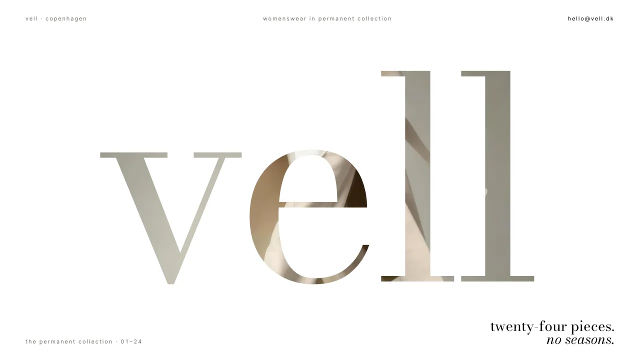
Everything is lowercase, because nothing here is competing for a season's attention. The hero says vell, then twenty-four pieces, no seasons. Under it, the three cloths and one line pointing at the appointment. Then the page stops talking.
There is no accent colour. Not a muted one, not one held back for a button. None. The palette is three whites (#FAFAF8, #F1F1EC, #E9E9E3), a hairline at #DDDDD5, and black. Black never becomes a background; it exists only as type and one-pixel rules. Shadows are banned, so depth comes from the whites and the hairlines.
Bodoni Moda carries the wordmark and the garment names, lowercase at every size. Inter Tight carries the captions, the labels and the running 01/24 numbering in tabular figures. Everything else is space: section paddings up to 12rem, and a wordmark sized against the window itself, min(46vw, 78vh) on desktop, hand-kerned span by span, or ll would end the word in a wall of two identical bars.
The signature move
The hero is one campaign photograph, full bleed, under a white plane with the wordmark knocked out of it. mix-blend-mode: screen turns the black letterforms into holes, so you do not read vell on top of the photograph. You read it through it. The brand name is made of the product.
Scroll, and the plane lifts like a blind, scrubbed rather than timed: it is tied to scroll position and never to a clock, so it advances across a 220svh runway only as far as the reader takes it, while the photograph beneath it settles out of a 1.06 scale. The last stretch of the runway is a held beat: the photograph simply there, whole, unchanged, which is the brand's whole argument made structurally instead of in a sentence.
Then the collection. Six of the twenty-four on an asymmetric grid at unequal spans and vertical offsets, each tile arriving with a vertical curtain-wipe: a clip-path opening bottom to top while the image settles out of the same 1.06 scale. Hover a piece and it swaps to a tighter crop of the same photograph, its name and number rising on a plate: agnes coat, 01/24. Beneath it, the plain fact: 01 · agnes coat, third cut since 2019 · recycled wool.
Take the colour away and the layout has nowhere to hide.
Why it converts
Fashion e-commerce sells on a clock. New-season banners, drop countdowns, a red bar across the top, three left in your size. Those instruments work when the goods expire, and they teach a customer to wait for the price to fall. VELL has nothing that expires and nothing that falls. Run that kit here and the site argues against the label it sells.
So the kit is gone, and the colour it prints in went with it. With no accent, nothing can be flagged, and hierarchy has to come from scale and space alone. That forces honesty: the biggest thing on the page is the name, and the address that ends the catalogue, hello@vell.dk in italic Bodoni at up to 6rem, is enormous because writing is the main thing to do here. Nobody is being nudged toward it. A weak layout would have nowhere to hide. That is the reason for taking the colour away.
The other door is the appointment: the piece, the city, the day, a name, an email. Five fields on a solid mat, one hairline under each. A wrong field has no red to print in; the rule beneath it inks, and the error is the only black caption on the page. Submit, and the panel that answers leads with the truth: this is a concept build, and nothing was sent.
The selling is left to facts the label can prove. The archive lists all three cuts of the agnes coat with their years and marks the current one, so an improved piece reads as a promise kept rather than a new product. Repairs are posted to bredgade 24 and most come back within ten days, sewn in matching thread, or in a thread that shows if you ask for it. At the bottom, where a site like this normally captures your email: we do not have a newsletter. write when you need us.
How it is built
Coded, not mocked. React and GSAP drive the scrubbed plane-lift and the curtain-wipes. Turn motion off in the operating system and none of it runs: the runway collapses to one viewport and the hero is already the finished composite. Turn JavaScript off and the page is the same page.
Contrast holds without colour doing any of the work. Secondary text is #6B6B63 on gallery white, clearing 4.5:1, so the captions and the 01/24 numbering are read rather than merely seen. The knockout costs nothing in access either: the wordmark stays a real h1 that reads as one word to a screen reader, and every garment carries its own alt text in the collection.
The photography is self-hosted WebP from a single shoot, sized per breakpoint and matted in #F1F1EC everywhere except the hero, the one place the mats are dropped. It works on a phone in one hand, and it passes a production build.
VELL is a fictional Copenhagen label, invented so we could build the site it would need. The company is not real. The build is: every section, every garment plate, every line of code.