The brief
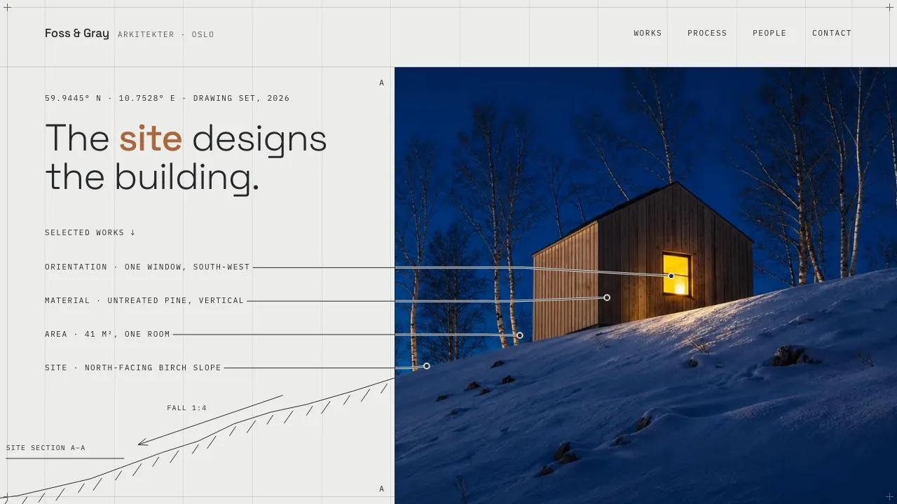
Foss & Gray are nine architects in Oslo. Houses, cabins and small public buildings: 43 of them since 2014, from Agder to Troms, none of them large. Their whole claim is the first thing on the page, five words long. The site designs the building.
That is an easy thing to say standing on a slope, pointing at where the snow drifts. It is hard to say on a website, where every studio says something close to it and none of them has to show their working.
This is also the most demanding audience on the list. These visitors read layouts for a living, and they will judge the studio by its website the way they judge a building by its junctions.
The idea
So the page is not a portfolio. It is a drawing set.
Behind everything sits the page's own grid, drawn as hairlines at nine percent ink, on the same track the thesis, the plates and the register are laid out on: twelve columns on a laptop, four on a phone, because a phone never lays anything out in twelve. Photographs are matted and framed like plates on a table: nothing zooms, nothing drifts past on parallax, and only one image is allowed to bleed: the hero, which has to enter through a drawn section line to earn it. Sheets are numbered 01 to 07, the hero first; the enquiry is filed as Annex A.
Every fact wears mono. Site, year, area, status. Job numbers (FG-2417), the bearing and month under each photograph (Looking S · Mar 2025), the studio's coordinates above the headline, 59.9445° N · 10.7528° E. If it is a fact, it is IBM Plex Mono at 11px, uppercase. If it is an argument, it is Space Grotesk. Nobody has to work out which one they are being handed. Nothing wears that register unless it can be checked: a photograph has no scale, so the plates carry a bearing and a month instead.
One colour survives, and timber never fills an area larger than a word. It marks site in the headline, the status of the one project that is on site rather than finished, the nodes where leader lines land, and the email address. A red pen is used on a drawing rarely, and only where a decision lives.
The signature move
The drafted line. One pixel of graphite that draws itself, once, and never fades in.
The hero is where it earns the page. The site opens as one drafting sheet: a site section of snow crest, earth hatch, the dashed line of assumed bedrock, nine birch trunks and the annexe on its four footing pins, inking itself in drawing order. Then the section line A–A draws down the sheet and the photograph floods in from the cut: the drawn cabin replaced by the real one at blue hour, the drawn crest continuing as the photographed crest across the seam. Four annotations cross the cut on paper-cased leaders and pin their claims to real pixels. Scroll early and the sequence jumps straight to its end; nothing waits for the scrollbar.
Selected works keeps the habit. Each plate's frame goes down first, clockwise from the top-left, in the order a hand would lay it; the photograph comes up inside, and leaders thread from the margin annotations to the pixel of the photograph they name, each landing on a small timber node. Roofline follows the ridge. Footings: four points, no blasting. Charred spruce cladding. Tide range ± 0.4 m.
Those annotations are the argument. They are not adjectives about the work but decisions the studio made, in its own words, pinned to the spot in the photograph where you can go and look at them.
Under the plates sits an extract from the register: six jobs, 2021 to 2027, with area and status. Eldhus Community Hall, Lom, 410 m², still Drawing. Hellvik Ferry Shelter, 28 m². The 28 sits in the same table as the 410, because in a studio of nine it was the same job. Process gets the page's scrubbed datum line, ticking through survey, sketch, detail, build at the speed of your scroll; apart from it and the hero's exit, everything plays once and stops.
If it is a fact, it is mono.
Why it converts
Architecture studios fail on the web in one predictable way. A full-bleed slideshow of hero shots. Project names with a year attached and nothing else. A paragraph about light and materiality that would sit on four hundred other sites. The photography does all the work, and nothing on the page shows that a person made a decision.
A client with a plot wants to know how the studio thinks, and what a project like theirs looks like on paper. This page answers in numbers. 187 m². 64 m². 92 m². Completed, completed, on site. Nine people, named, with what each of them does. Eight or ten projects a year is all nine of us can draw properly, printed plainly above the enquiry, because a studio that is coy about its capacity will be coy about its fees.
The closing ask is the studio's own. Start with the site. Write before the plot is final, if you can. The enquiry is Annex A of the set: project type, site, budget band, timeline, the brief as far as it goes. A person with a plot can act on that this afternoon.
A design-literate reader judges a drawing by what is left off it. Nothing decorative appears on this page that a working drawing would not carry.
How it is built
Coded, not mocked. React, GSAP and ScrollTrigger, in the repo, running.
The hero drawing is traced in photo pixels. The crest and the cabin were read off the photograph by per-column edge detection, into an SVG whose viewBox is the photograph's own 1672 by 941, so one drawn unit is one pixel: the seam at the cut is true by construction, and a leader that names the window ends on the window. A leader that cannot be anchored is not drawn.
A visitor who has asked for reduced motion, or who arrives with JavaScript off, gets the finished sheet at once, already cut open to the photograph. The drawing is the default. Drawing it is the enhancement.
The annotation grey started at #6A6D71, measured 4.43:1 against the paper, failed AA, and was darkened to #5F6266 at 5.23:1. Small print about a building has to be readable.
Foss & Gray is a fictional studio, invented so we could build the site it would need. The practice is not real. The build is: every plate, every annotation, every line of code.