The brief
SUMI is a fourteen-seat sushi counter on Britton Street, Clerkenwell. Nine courses, £145 a head, two seatings a night, 18:00 and 20:45. The knife does most of the work; a bed of white binchotan finishes three courses. There is no dining room in the usual sense. There is a counter, and there is the quiet around it.
That is a hard business to sell in a screenshot. Nobody books a room like this because the food was described accurately. They book it because they can already feel the place: the warm length of hinoki, the low light on it, a chef three feet away who has to look you in the eye while they work.
So the site has one job, and it is not to inform. It is to make the room feel inevitable, and then get out of the way of the booking. Everything else on the page is a tax on that.
The idea
墨 is ink. 炭 is charcoal. In Japanese they are the same syllable, sumi, and that homophone turned out to be the whole design.
A calligrapher makes one mark, once, and cannot take it back. A sushi chef does the same thing with steel: the yanagiba is drawn through the fish in one pull, and the face it leaves is the finished surface of the food. Nothing on the menu steps in to cover a hesitation. Soy is a six-minute cure, nitsume gets one brush, and the cut face is the surface you eat. The charcoal holds the other half of the name: white binchotan burns at 400°C with no flame and no smoke, finishes three of the nine courses, and contributes nothing of its own. That is the point, and it is also the risk. A fire that adds nothing cannot cover anything up.
So the page is a sheet of ink-black paper, and a brushstroke is drawn down it as you read. The restraint is not an aesthetic preference. It is an argument about the craft.
The signature move
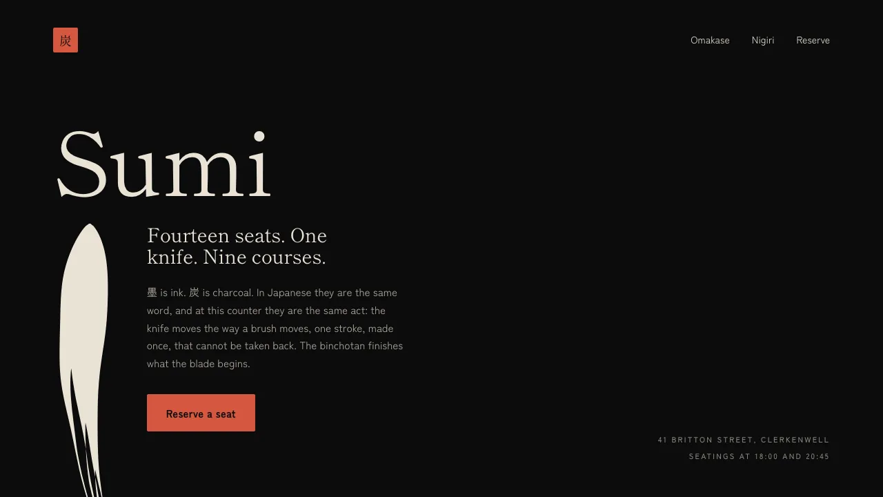
One calligraphic stroke is the identity of the page. It is not a rule or a divider. It has a wet, tapered edge, thick where the brush pressed and thin where it lifted, split into dry hairs where the ink ran out, and it is built as a filled SVG contour revealed by a mask, because a stroked path has one width for its whole length, and one width is a rule, not a brush.
The mask is the whole trick. A line that merely grows looks like a progress bar; a shape revealed downward looks like it is being painted. And where there is scroll to spend, scroll owns the brush: the wet tip sits exactly where the reader put it.
The stroke is made in two places, driven differently in each. The hero has no scroll above the fold to spend, so its mark is made once, on arrival, in one 1.9-second tween from the wordmark's baseline off the bottom edge, because a stroke scrubbed against a trigger that begins above the fold sits half-drawn at rest. In the omakase the mask's height is set straight from the pinned stage's scroll progress, with no easing at all: any easing makes the tip drift ahead of or behind the scroll position, and the moment the reader notices the lag, the illusion dies.
In the omakase the stroke is the spine: a pinned viewport where the nine courses turn as the ink descends their column. Nine ticks are drawn under the stroke, and the column of them is cut at the ink's own front, off the same number, so a tick cannot exist until the brush has been there. Each tick's left end then runs under the ink, and what shows of it is whatever the brush is not covering, down to the gaps between the dry hairs at the tail. Each course arrives when the tip passes its tick, and hangs off it: one number, one name, one line of kana, one sentence. Beside the type, nine plates crossfade, one frame per course, because a plate that sits still while the course moves reads as a broken component, not as restraint. Then the stroke dries. It never redraws and never loops, because a stroke remade is a stroke ruined.
The knife gets one pass. So does the page.
Why it converts
A restaurant page converts on two things: the room, and the ease of getting into it. Most of the craft here is spent on the first, so the second is deliberately blunt. A reservation form sits at the end of the page, and the header, the hero button and the footer all point at it.
The form is real. It validates the email, refuses a party the counter cannot seat (one to eight, because fourteen seats and two seatings is the entire capacity of the business), puts every failure into a sentence, "The counter seats one to eight", rather than leaving a red underline to explain itself, and clears each error the moment you start fixing it instead of waiting to scold you at the next submit.
But it sends nothing, and it says so. SUMI does not exist, so the one honest thing a booking form can do at the exact moment a visitor would hand over a real email address is admit that. The success panel therefore leads with the disclosure: this is a concept build, nothing was sent, here is how it was made. Then it shows the booking underneath as flavour. That order is the point. The conversion design still gets to work, and nobody is fooled.
The accessibility work is part of the conversion argument, not separate from it. Every colour pair was computed rather than eyeballed, and doing so caught two failures that would have shipped: the placeholder colour sat at 4.33:1 against the form field it lives in, and the vermilion button label at 4.07:1. Both are now above 4.5:1. A booking form nobody can read is a booking form nobody completes.
How it is built
Next.js App Router, React 19, TypeScript strict, Tailwind v4 plus the case's own `case.css`. GSAP with ScrollTrigger drives the stroke and the pinned omakase; Lenis smooths the scroll. The case imports nothing from sharphaw.com: no shared component, no shared token, no shared stylesheet, and a test enforces that wall.
Type is Shippori Mincho over Zen Kaku Gothic New. A mincho is a brush-derived serif: it carries the entry and exit strokes of a written character, so the signature motif and the headline typeface are the same gesture at two scales.
Under `prefers-reduced-motion` the case does not degrade; it changes shape. Lenis never mounts, no ScrollTrigger is created, the pinned section becomes a plain readable list of the nine courses, and the stroke renders already drawn. Nothing is lost except the motion, which is the only thing that was ever optional.
SUMI is a fictional restaurant. There is no counter on Britton Street, no omakase, and no reservation. The booking form validates, then tells you it sent nothing. It is a SharpHaw concept build: a complete, coded website for a company that does not exist, made to show the work rather than to describe it. No real business, person or institution is named in it.