
The brief
ARBOR writes the first cheque. Fund III is $240M, cheques run $500k to $3M, and the target is 12% at seed. The brief arrived with the hero already specified almost to the pixel: a full-bleed video, a liquid-glass navbar, a heading that assembles itself character by character, and one absolute rule underlined twice. No scrim on the video. No gradient, no dimming layer, nothing.
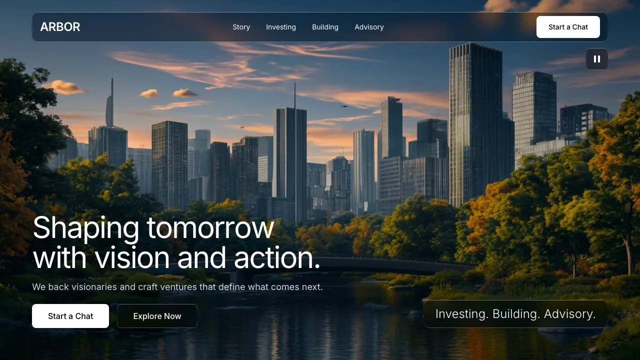
That rule is the reason most video heroes look the way they do. A dark wash over the footage is how you guarantee white type stays legible, and it is also how you turn a film into wallpaper. Forbidding it means the type has to survive whatever the video is doing underneath it.
The harder problem is what a seed fund can honestly say. It has no exits to point at, no brand the founder has heard of, and no access it can prove. Every fund site in the category solves this by writing the same sentence about backing visionaries, and the founder reading it has seen that sentence forty times this month.
The idea
The footage was already making the argument. It is a ten second timelapse of a skyline seen across a park: a forest in the foreground, towers behind it, water below, dusk turning into full daylight. The trees are in front because they were there first. Every tower behind them was once a gravel lot with a fence around it.
So the page defends one line, and only one: we saw the tower when it was a lot. It is the single claim a pre-seed fund can actually back, because it is a claim about the past rather than the future.
That line is also the headline, which is the one place this build departs from the brief. The brief specified the visionaries sentence verbatim, and everything else about that first screen was kept: the raw footage, the glass navbar, the heading that assembles itself character by character, the two-column bottom-aligned layout. Only the words changed, because a first screen any fund could have shipped is a first screen that argues nothing, and the brief's buttons promised a chat the build does not have.
The type followed. The page makes a large claim in nine words, so it has to be quiet everywhere else, and the typography is where it is quiet. One family, Inter, four weights, no display face brought in to shout over it. The ledger needs its columns to line up, and rather than drag a monospace face onto the page for it, the figures use Inter's own tabular set.
The signature move
The brief's liquid glass could easily have stayed a skin: a frosted navbar, a frosted tag, the look every venture site has adopted this year. Instead the glass became an instrument, and the page uses it as one.
Outside the pane, the tower. Inside the pane, the same coordinates before it was built. It is not a blur and it is not a dim: it is a different photograph, showing cleared lots, chain-link, a crane and a grain silo standing exactly where the towers now stand.
The two plates share one camera. The skyline is a frame lifted straight out of the hero video, so the city in the Lens is literally the city you just watched go from dusk to noon. The other plate is that same frame with the towers edited away, which is why the park, the stone bridge, the rocks in the water and even the clouds line up across the edge of the glass. The pane reads as a window rather than a cut, and that only works because nothing behind it moved.
On scroll the figure goes sticky and the pane travels the skyline, landing on four towers in turn. Each landing swaps the term sheet: Halyard, pre-seed, $600k, 2016, when it was two people and one terminal in Rotterdam willing to run it for a month. Pallas, seed, $2.1M, 2018, a dispatch model on a laptop in a leased warehouse bay with no licence to sell power. Kiln, a furnace that had run for forty hours and cracked on the forty-first. Sable, eleven customers and a letter from the regulator they had not opened.
The window is one component, rendered in five places, so the motif recurs structurally rather than by description. It is the Lens plate. It is each term sheet's own window in the static fallback. It is the preview beside the ledger, where every row is a control that aims the same glass at that company's tower, which gives all eight the treatment the Lens gives four. It is the close, where the last plate carries a line for the reader: yours is not on this skyline yet.
And it is the one section that gets a third state. The Lens argues the lot against the tower, but the eighteen months in between is what a seed fund actually sells, so the Building section holds the same window over the same towers half-built: concrete frames, open floor plates, green safety netting, a row of cranes. The part nobody photographs. One motif, three moments in time, and the section that owns the time axis is the one that gets the third.
Outside the glass, the tower. Inside the glass, the same gravel lot it was built on. That is the whole pitch, and it is one gesture.
Why it converts
A founder choosing a seed investor is not comparing returns, because at seed nobody has any. They are trying to work out whether this fund will be useful in the eighteen months when the company is still ugly. So the page answers that instead of dodging it.
The commercial terms sit on the page rather than behind a meeting: the cheque size, the ownership target, the reserve for the next round, and an answer inside ten working days after two meetings, with the real reason in writing if it is no. The Building section publishes an actual schedule, day 1, month 2, month 4, month 12, which is a thing a founder can hold the fund to later. Advisory names its fee, $18,000 a month, and then does the one thing that makes it credible: if ARBOR decides it wants to invest, it resigns the engagement before it asks.
And the Lens is doing the conversion work the copy cannot. A fund that says it is early is making a claim. A fund that shows you the gravel lot, with the date and the cheque printed beside it, is showing evidence. The founder reading it is being told, without a single adjective, that their own unglamorous mess is the thing this fund is set up to recognise.
How it is built
The no-scrim rule was measured rather than taken on faith. The footage was sampled underneath the actual rendered type box at nine viewport widths from 390 to 2560, across six frames spanning the ten second loop. The type sits in the dark water-and-foliage band at the bottom of the frame, mean luma 34 to 39 of 255 even as the sky climbs to noon, and the worst fifth percentile anywhere is 5.76:1 against a 4.5 requirement. That measurement is also why the heading holds two lines: a third line climbs out of the dark band into the sunlit tower faces and takes the contrast argument with it.
The Lens is two photographs and a moving clip path. No canvas, no video scrubbing, no image sequence. Three custom properties carry the pane, its centre and its top and its height, and both the mask and the glass frame read from all three, so the window and its border can never disagree. The top is per company because the skyline is not flat: cut at one height the window filled with sky that was identical on both sides of the glass, and the substitution stopped reading as a removal.
The static state is the default rather than a fallback. Ask for no motion, arrive with dead JavaScript, or open the page on a phone, and the section renders unstuck as four term sheets, each carrying its own window onto its own tower. That state shows all four substitutions at once, which is more of the argument than the scrolling version holds at any single moment.
The contact form takes a solid surface rather than the glass. Glass over flat black composites to nothing, so on the page's one conversion surface it was doing no work except hiding the field edges at 1.66:1, which fails the non-text contrast rule. The border a control is identified by is a thing you have to measure too. The form submits nowhere, and it says so before you type rather than after.
ARBOR is a fictional venture fund, invented so we could build the site it would need. There is no Fund III, no book, and none of these companies exist. The build is real: the three plates, the measured footage, the moving pane.